Hiroshima Appeals Poster Campaign
Hiroshima Appeals Poster Campaign
The Hiroshima Appeals is a poster campaign themed on Hiroshima’s Spirit that transcends words to widely convey the prayers and wishes of Hiroshima, which experienced the ravages of the first atomic bomb used on mankind. Since 1983, with the first poster Burning Butterflies by Yusaku Kamekura, JAGDA has designated a member designer to produce a poster each year until 1990, and resumed in 2005 to commemorate the 60th anniversary of the end of World War II. The posters are presented to the mayor of Hiroshima City every year, and were presented to member cities of Mayors of Peace in 2005 and 2008. They were also exhibited at Press Centre of G7 Hiroshima Foreign Ministers’ Meeting in 2016. In this way the posters have promoted peace at home and abroad.
Sponsors:
Hiroshima International Cultural Foundation
Japan Graphic Design Association Inc. (JAGDA) Hiroshima Chapter
Cooperation:
Toppan Inc.
Takeo Co., Ltd.
Designers:
1983 Yusaku Kamekura, 1984 Kiyoshi Awazu, 1985 Shigeo Fukuda, 1986 Yoshio Hayakawa, 1987 Kazumasa Nagai, 1988 Ikko Tanaka, 1989 Mitsuo Katsui, 1990 Eiko Ishioka, 2005 Masayoshi Nakajo, 2006 Koichi Sato, 2007 Shin Matsunaga, 2008 Masuteru Aoba, 2009 Katsumi Asaba, 2010 Keisuke Nagatomo, 2011 Susumu Endo, 2012 Yukimasa Okumura, 2013 Kaoru Kasai, 2014 Tsuguya Inoue, 2015 Taku Satoh, 2016 Takahisa Kamijyo, 2017 Kenya Hara, 2018 Kazunari Hattori, 2019 Katsuhiko Shibuya, 2020 Yoshie Watanabe, 2021 Takuya Onuki, 2022 Kashiwa Sato
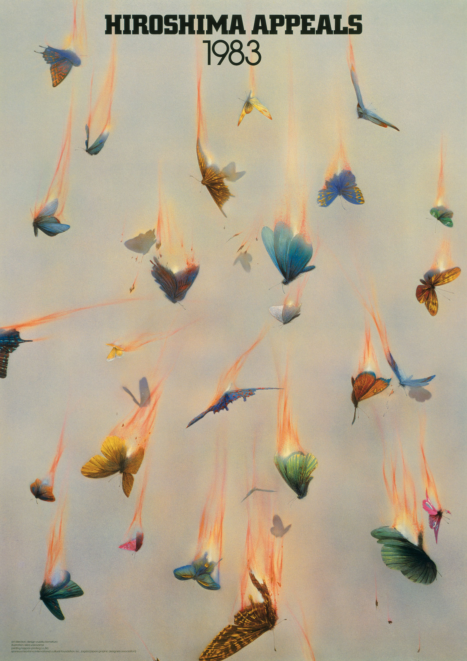
Hiroshima Appeals 1983 “Burning Butterflies” by Yusaku Kamekura
I concentrated on producing a poster for Hiroshima Appeals on pure, neutral grounds; a poster divorced from politics, philosophy and religion. I also sought to stay clear of conventional expressions such as the vaguely antinuclear calls for peace that have predominated in posters of the past and, if at all possible, to create an antinuclear poster that approached the issue from a new perspective.
I made a small sketch of my idea and gave it to the talented illustrator, Akira Yokoyama. Yokoyama listened to my ideas and came back to me with an illustration a month later. My first thought on seeing this first illustration, however, was that it lacked force and, having devoted a day to pondering the problem, I concluded that further prompting was needed. I explained to Yokoyama that I wanted the flames to take center stage and that the beautiful butterflies were to serve as enticement for the fire. Yokoyama was reluctant to tamper with his original flames, but I asked him to take his courage in both hands and make them stronger. The revised illustration reached me two days later. The flames were a little stronger, but I wanted a still stronger visual. Just as I had envisaged, the butterflies had been drawn in exquisite detail and the illustration was pregnant with pathos. I was seeking to create real fear by giving visionary expression to the menace of nuclear arms in the form of beauty going down and being extinguished by flames. To engender this sense of fear, the poster needed to have a strong impact and I achieved this by trimming and enlarging Yokoyama’s illustration and intensifying the flames in the printing process.
Each year, a designer is asked to produce a poster for Hiroshima. Being asked to produce the inaugural poster was a heavy duty, but I am happy with the result and proud to be its originator.
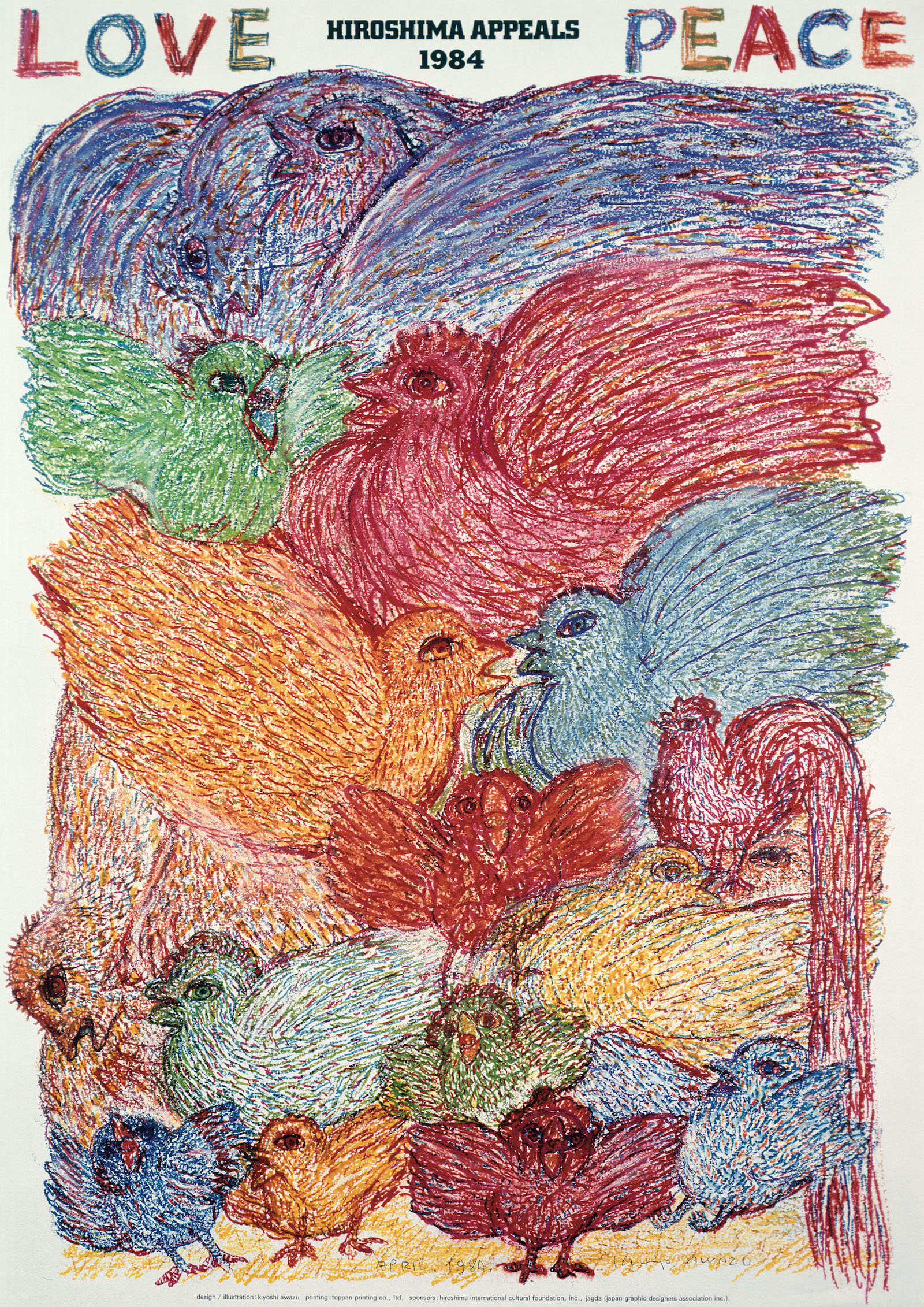
Hiroshima Appeals 1984 “A Diversity of Birds” by Kiyoshi Awazu
“Burning Butterflies”, the poster for last year, had a figurative motif. I took “A Multitude of Birds” as my theme for 1984 because I wanted to create a bright, dynamic image.
There is a song called El cant dels ocells (The Song of the Birds) that was composed by the Spanish Catalan cellist Pablo Casals, a friend of Picasso’s, on the basis of a Catalonian folk tune. Of this song, Casals has said that: “Birds sing when they are in the sky, and their song sounds to me like: “Peace, Peace, Peace!” This song moved and inspired me and, since hearing it, I have taken to sketching and observing the birds that visit my garden. Watching the birds, I began to see how human they look in their behavior. This poster features seventeen birds, but they are drawn to emphasize their human qualities. There are old birds and young. They are drawn with eyes wide open and mouths agape as if clamoring to communicate something. What that is, I leave to the imaginations of the people who view this poster.
I have nicknamed this poster: Love & Peace. It may well be a commonplace phrase, but I believe it remains the eternal wish for humankind.
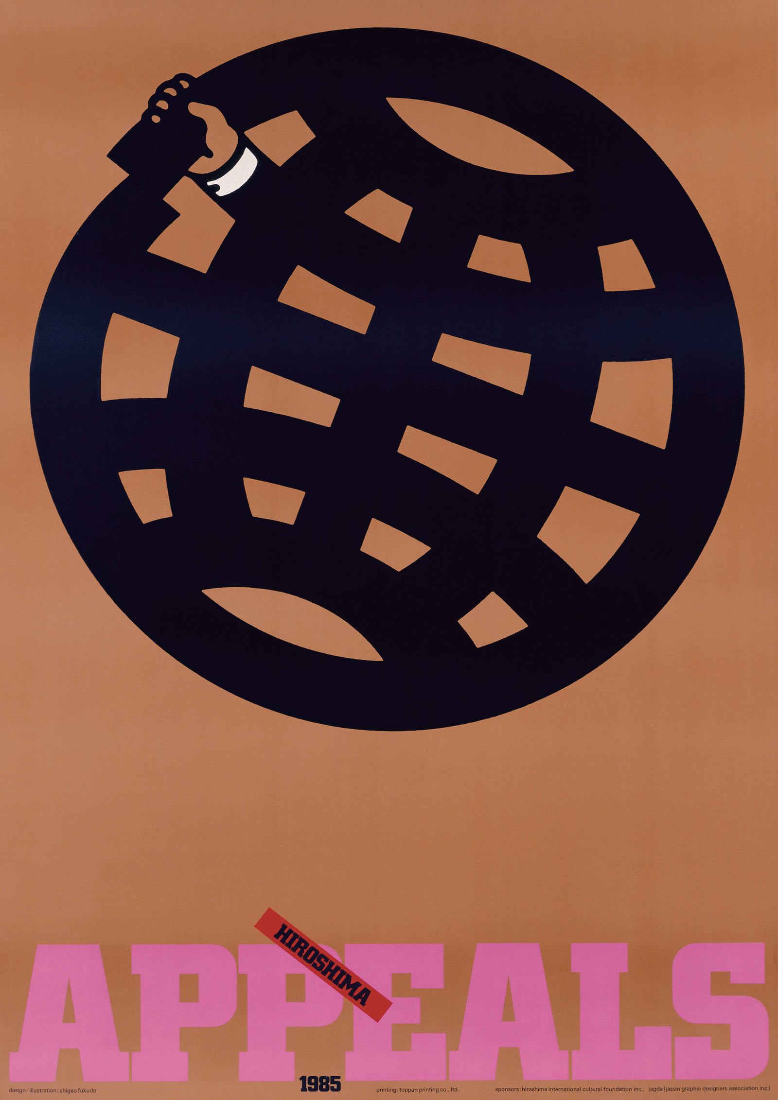
Hiroshima Appeals 1985 “The Earth” by Shigeo Fukuda
The difficulty of commending “Peace” to a single poster is akin not just to the present-day war of the worlds, but also to the intricacies of the fundamental issue of human happiness, including the reality of a global food crisis.
Thinking in terms of the poster as a contemporary “statement” and in light of the fact that this is the third in the series of Peace Posters to be proposed by JAGDA, I developed my design with the idea of emphasizing one act that people of this earth should not commit in respect of others. I also endeavored to create an image that was different in style to those of the first two posters in the series.
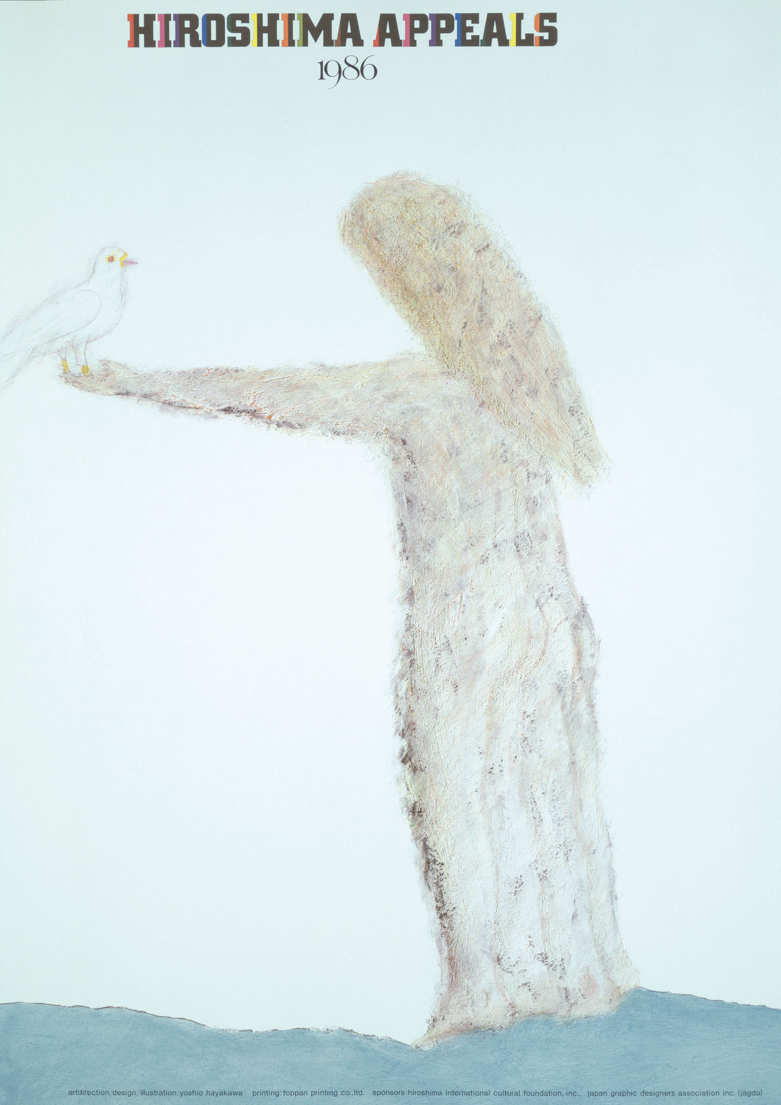
Hiroshima Appeals 1986 “Child with Dove” by Yoshio Hayakawa
In creating this poster, my first thought was to avoid direct expression of “violence”, “war”, “nuclear explosion” and other images antithetical to “peace” because such graphic scenes have received more than sufficient airing on broadcast media and because, unless the creator who takes such motifs for his design is highly competent, the poster is more likely to generate antipathy than to move those who view it. I was, however, against seeking a Utopian representation of “peace” because I felt that such would be lacking in impact.
My method, in deliberately selecting the most popular image of a child with a dove as the vehicle for my appeal for peace, was to enable the viewer to intuit the nature of the poster at a glance whilst adding an aesthetic appeal that would render the image more powerful. The overall impact of “design” being more effective than a semi-realistic illustration, I simplified the elements on the page as far as possible, reducing the background to the white of the “paper” and erasing all markings to free the image from its pictorial roots, relying on a “new effect” born of the merger of two heterogeneous aesthetics in the process of apprehending space: illustrative components and a design sensitivity.
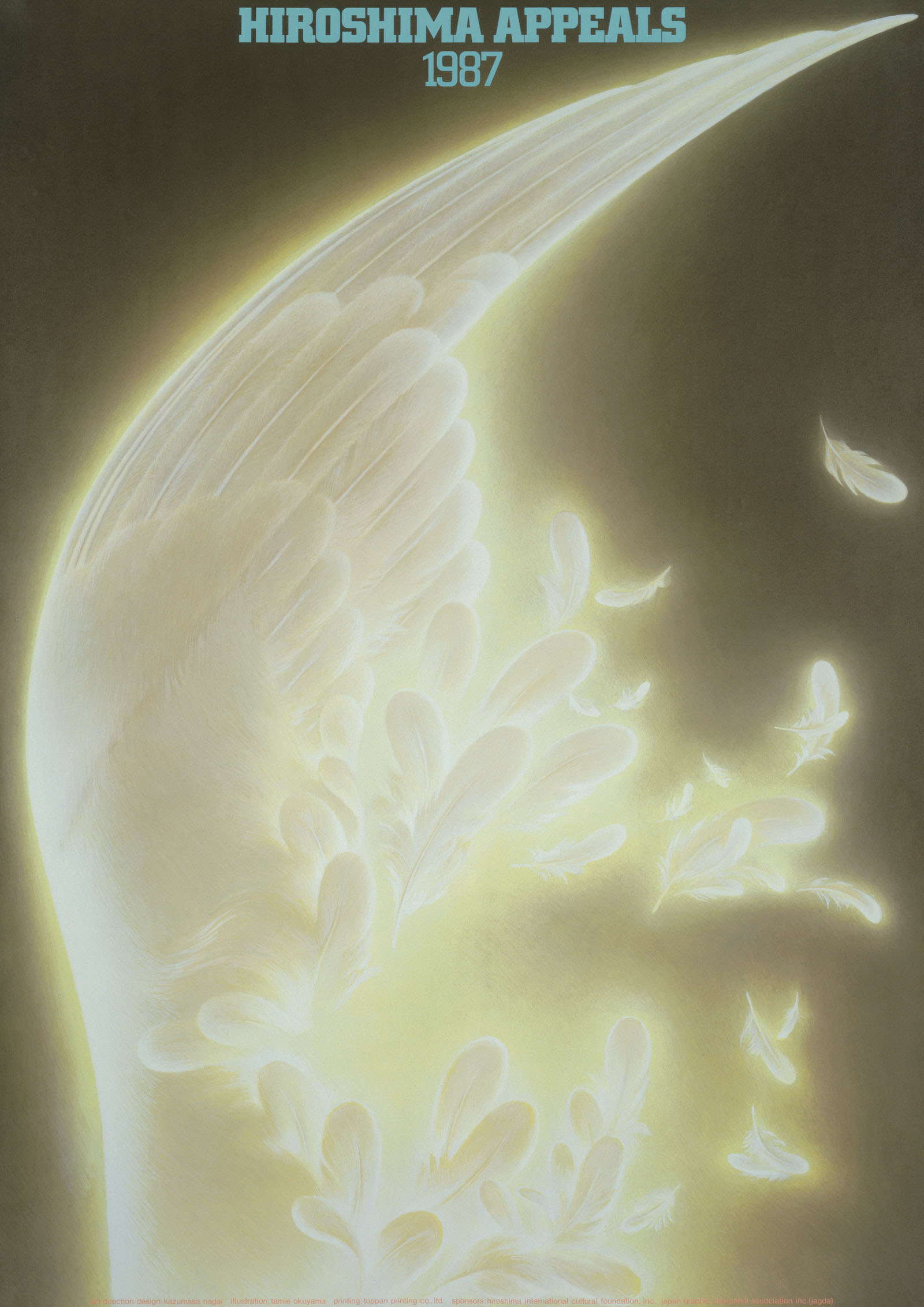
Hiroshima Appeals 1987 “Serene Flight Shattering in A Single Flash” by Kazumasa Nagai
The more you think about it, the harder it is to come up with an antinuclear poster. I thought initially to create something based on my own aesthetic principles, but felt that an abstract representation of my art and design was not appropriate to a poster intended to make a powerful appeal to many people. The idea was to come up with a poster that would appeal for an end to nuclear arms that was steeped in the reality of Hiroshima rather than forming an image on a personal, individual level.
This led me to use illustration and I came up with something that accords with my aesthetic principles, but asked the artist Tamie Okuyama to draw for me due to the difficulties of satisfying established illustrators with the image I had in mind. Okuyama’s illustration provides a faultless representation of my idea: the wing of a bird in flight shown in close-up, its instantaneous destruction in a flash of light even as the pain of that image is confined forever in stillness to be sublimated in pious prayer.
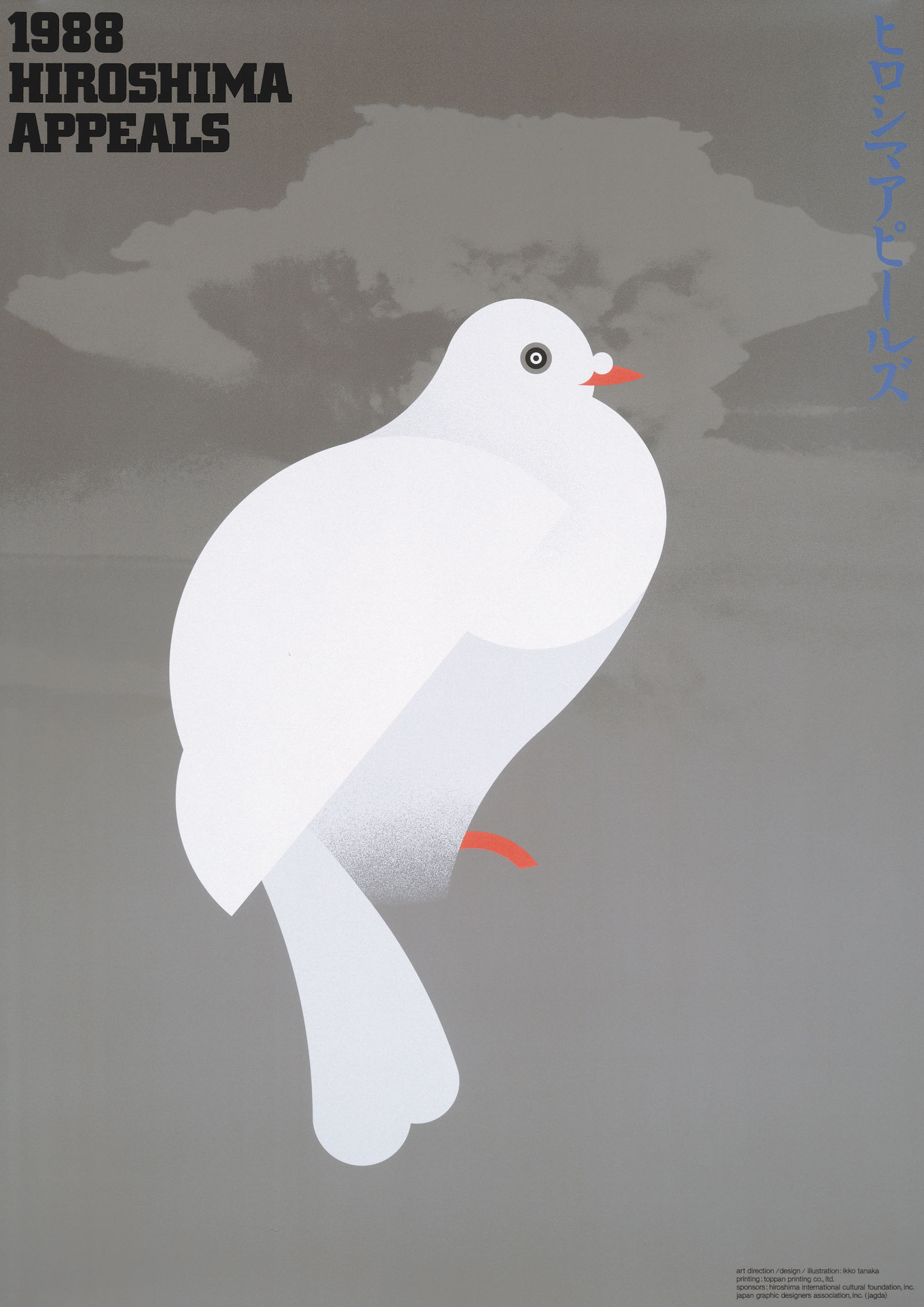
Hiroshima Appeals 1988 “A Single White Dove” by Ikko Tanaka
This poster takes as its motif a single white dove. The use of a dove as a symbol for peace in antinuclear posters has become a cliché, but as a visual language common to people throughout the world it has ultimate universality. I eschewed an urbane, awkwardly witty representation, instead favoring the imposing challenge of the white dove.
In giving visual expression to the purity, serenity and resoluteness of the dove, I sought to incorporate a prayer to counter the dark side of humanity. Moreover, though this dove was drawn using a compass to form a continuous geometric circle, I had the Pigeon on a Peach Branch by Emperor Huizong (China, 1082-1135) in mind, with the goal of creating a poster imbued with oriental ideas, rather than something in the Western style. The mushroom cloud spreading across the background of the poster is a lament for Hiroshima which should be remembered and incorporates a prayer for the abolition of the atomic weapons that threaten to annihilate the human race.
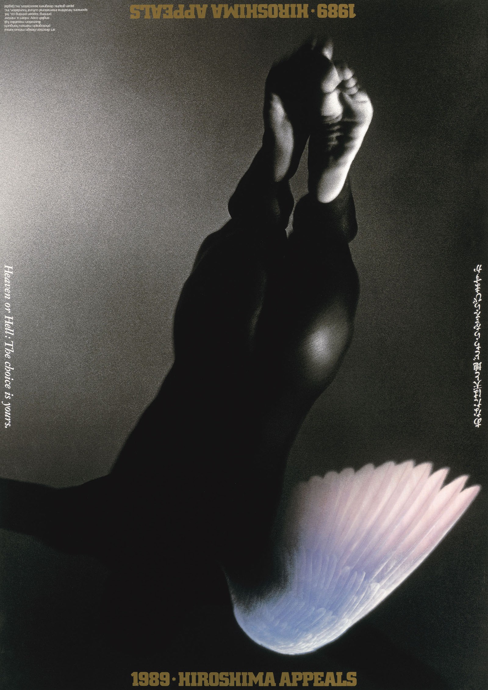
Hiroshima Appeals 1989 “The Vault of Hiroshima” by Mitsuo Katsui
It is often said that: “all that lives must die.” Those who raise a call for peace, however, know the supreme joy of living. For they know that only when man is free from threat of bodily harm can he appreciate life to the fullest.
Not long ago, I viewed a photograph taken by Mamoru Horiguchi entitled “1/8” depicting a sensuous black nude. Almost catatonically, yet with a sense of acute tension, I was totally transfixed by the photo. A month passed, and still I could not drive it from my conscience. On the contrary, I became all the more captive to its spell with the passing of time.
It was during this lingering mood that I saw the German film “Der Himmel Uber Berlin” (Sky Over Berlin) from director Wim Wenders. As I watched the film, the sensuous black body that had haunted me for weeks instantly acquired the wings of an angel.
Every living being pauses to look at the sky above him and wonders about the distant realms that lie beyond. In fact such musings may be “proof”, albeit extremely abstract, of man’s existence. Watching the German film, I recalled the sky over Hiroshima and I decided to revive my memories in the 1989 Hiroshima Appeals poster.
While producing the poster, I happened to glance at my unfolding work upside–down. That was when I realized that the angel that had all along been soaring heavenward appeared suddenly to be plunging headlong toward the depths of hell. Immediately I decided to retain this double interpretation, adding the caption: “Heaven or Hell: The choice is yours.”
If even one person in ten who take this poster in hand is inspired to invert it and ponder its dual possibilities––and mankind’s two choices––then he shall stand as verification of man’s wisdom and courage. It is to him that this poster is dedicated.
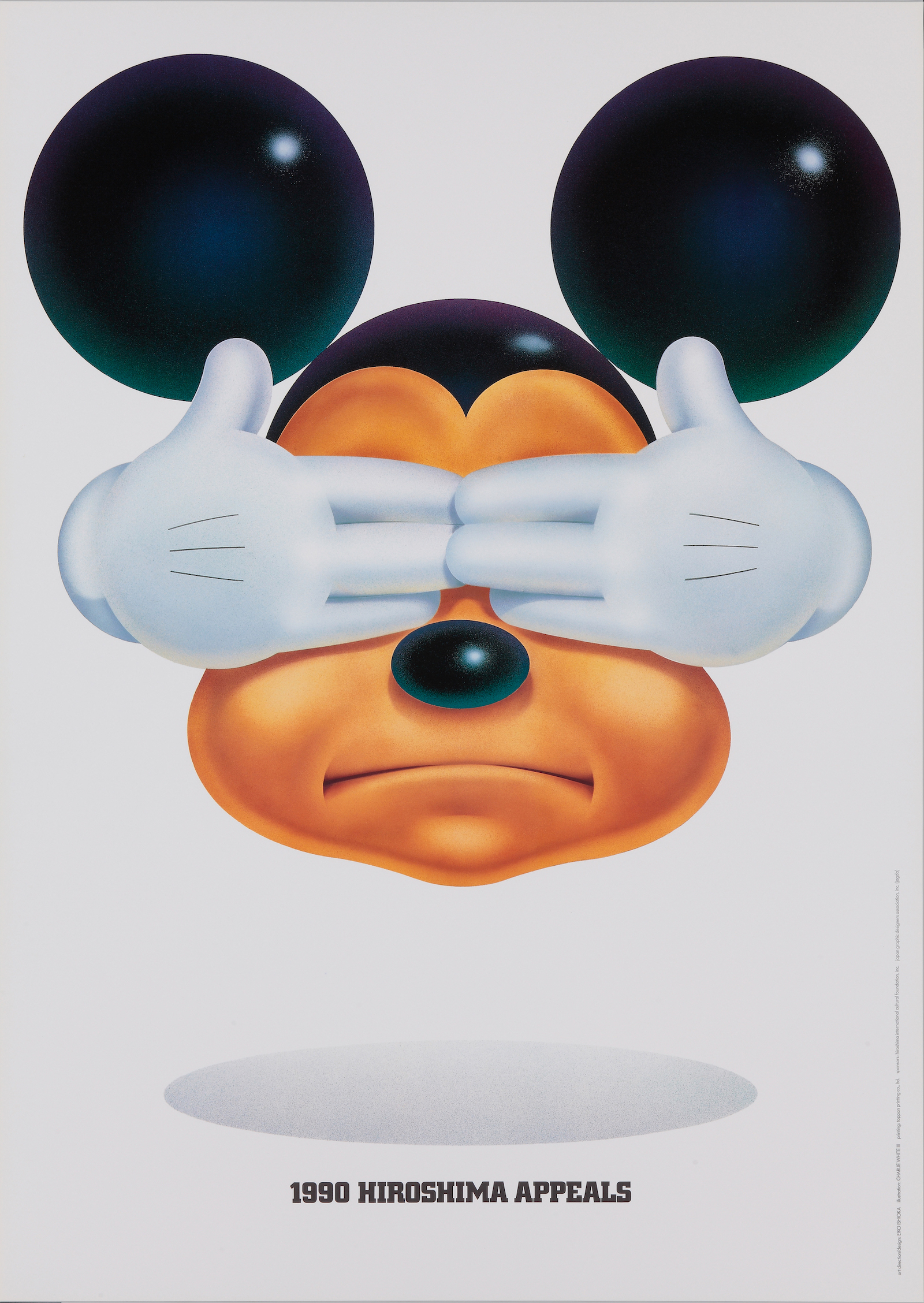
Hiroshima Appeals 1990 “The Silent Message of X” by Eiko Ishioka
Today, as the phenomenal developments in information technology keeps us constantly up to date with news from around the world, it has become quite difficult to speak of Peace and the tragedy of Hiroshima through the medium of the poster.
Back in more innocent days, before we dared even to conceive that we might one day have instantaneous access to world developments of every kind, the poster had impact of considerable force. But today, at a time when the poster has gradually retreated to being a primitive means of communication, is it still possible to recover its powerful brilliance?
The task is all the more imposing with a poster intended for worldwide distribution, as it must contain sufficient energy to awaken minds in all corners of the earth. For it is only when every person living on this planet is moved to action that the common goal can be achieved. But when this happens, even the impossible becomes possible.
Faced with the challenge of creating a poster for the 1990 Hiroshima Appeals campaign, I decided to devise an image symbolic of today’s majority. Through use of this image, I hoped to engender a feeling of tension between the poster and viewer. I call the image, which was inspired by Mickey Mouse, “Image X”.
Image X can be anyone: Mr. X, Mrs. X, Ms. X , Master X. In his usual state of mind, image X appears with his mouth wide open, his large and restless eyes looking off obliguely in some undefinable direction, disseminating winsome if meaningless charms. Yet here, Image X appears with his two hands resolutely covering his eyes and his mouth tightly closed, an expression of firm determination.
The poster is intended to make two statements. The first is “We don’t want to see the tragedy of Hiroshima ever again”– a warning against a reoccurrence of the greatest tragedy that ever befell mankind. The second statement is “Closing one’s eyes to the tragedy of Hiroshima is the gravest sin mankind can commit”– an admonition to those who might otherwise forget the lessons to be learned from Hiroshima.
This poster of 1990 needed a look desirable for launching the last decade of the 20th century. I decided to eliminate all artistic or literary overtones in order to covey my message with outspoken conciseness. I was ably assisted in this effort by the talents of Illustrator Charlie White Ⅲ, who vividly realized the exact conception of Image X which I had in mind.
Image X, standing solemnly in bright sunlight, speaks a silent and invaluable message. If it reaches out to all people beyond nationality, race, age, or sex, to incite them to think about the tragedy of Hiroshima, then and only will my aim have succeeded.
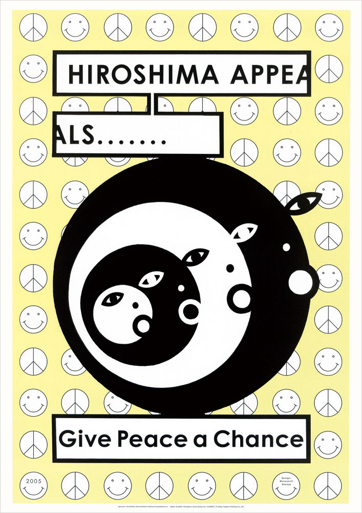
Hiroshima Appeals 2005 “Give Peace A Chance” by Masayoshi Nakajo
Though just a child, the headline in the morning newspaper: “New Type of Bomb…” sixty years ago, left an indelible impression on my innocent sensibility. During the massed air raids over Tokyo of March that year, I had seen the sky turn red from Chiba, the place I’d been evacuated to. Many family members and friends were lost in that blitz. The cycle of war has continued unbroken since that time. Attempts to negate this with the phrase “the horror of war” leave me feeling hollow and empty. One of my peers survived the bombing of Hiroshima. We became friends as fellow designers. Still suffering the after-effects of the bombing, in 1985, this man began work on a series of one hundred posters calling for peace: “The devastation remains fresh in my mind. I want to think about peace and love not in the immediate context of those images but within a visual framework that goes beyond it.” He died at the age of 59 having failed to fulfill this ambition. An exhibition of this works is being staged this summer. Although the sadness of Shu Kataoka was bottomless, there was a need for me to devote all my energy to this poster, having a link with him in my mind.
Wars in distant countries; conflict among ethnic groups; indiscriminate terrorism: in producing this poster I had to clear my mind repeatedly of doubts about my ability to communicate the preciousness of human life in a single poster. The result: an upbeat poster that will either amuse or irritate. If nothing else, I hope it will conjure up images of war and peace for individual viewers.
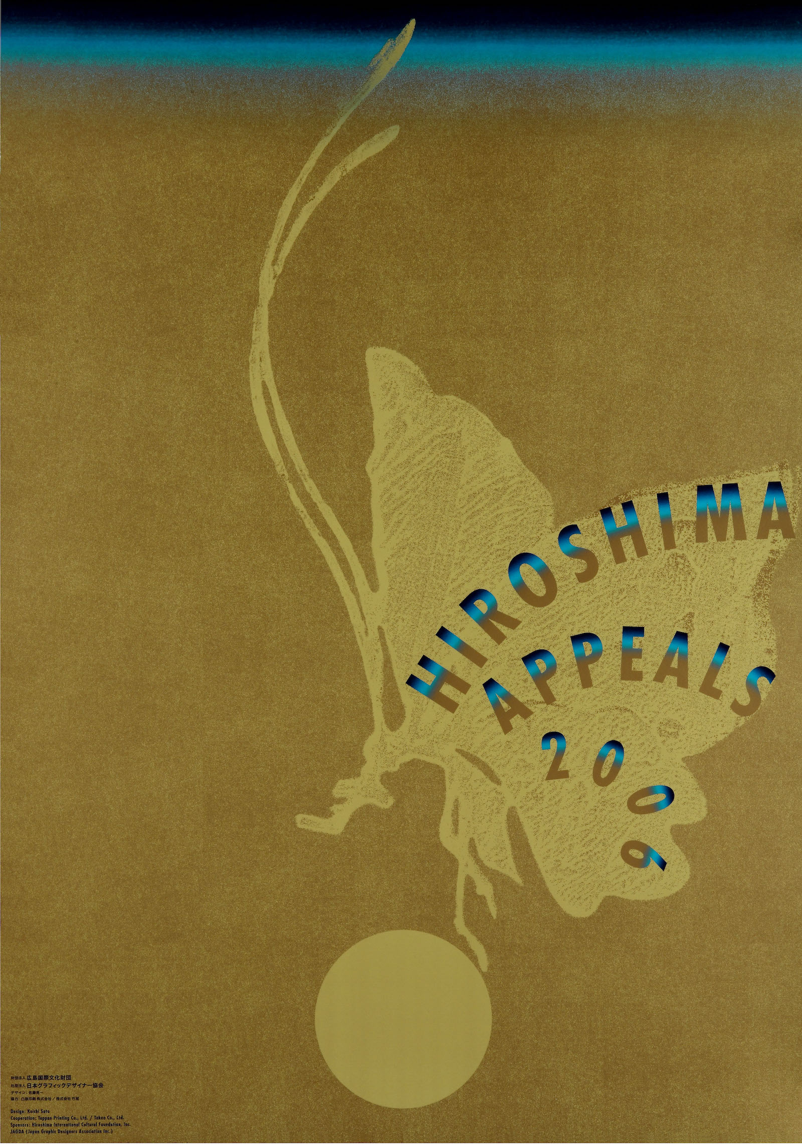
Hiroshima Appeals 2006 “Golden Butterfly” by Koichi Sato
In ancient times, people believed that the dead were reincarnated as butterflies. These beautiful winged insects that emerge from their hard chrysalises to float through the air remain mysterious to us, even today. Thinking of the many people who died when the atomic bomb was dropped on Hiroshima and the countless who have died in conflicts throughout the world, and sensing how endangered is peace in the modern world, I designed this year’s Hiroshima Appeals poster as a prayer for a cessation of hostility.
The gradation into blue at the top of the poster alludes to the ukiyoe woodblock prints of the Edo era, while the gold that colors most of the picture is intended to represent the world above, with the beautiful butterfly symbolizing the reincarnation of the victims of Hiroshima and world conflict.
The butterfly shape follows the stylized patterns found in the publications known as Koetsu-bon, or Koetsu Books and Saga-bon, or Saga Books that were available from the Momoyama Period (1573-1603) to the early Edo Period (1603-1868), and is one that I love. The text HIROSHIMA APPEALS 2006 is presented as a message from the soul revealed on the wings of the reincarnated butterfly. The orb that the butterfly seeks to defend represents both the wish for peace in our hearts and our star: the earth. In embedding a golden butterfly in a golden background I thought to visualize the profundity of this prayer. As a contemporary Japanese poster that incorporates the traditional printing arts of ukiyoe and Koetsu-bon, I was envisaging a simple composition that would also suggest the powerful space that is a Catholic or esoteric Buddhist altar. It is my hope that this image will be seen by many people and that they will feel free to interpret it as they wish.
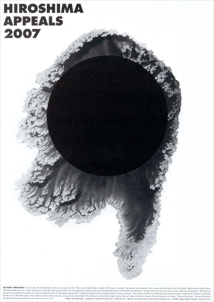
Hiroshima Appeals 2007 “NO MORE HIROSHIMA!” by Shin Matsunaga
It was a fine day in Hiroshima at 8:15 a.m. on August 6, 1945. There was a flash of light.
A right to life is given to anyone. The cruelest death suddenly visits a remote peaceful place from a battlefield.
Many innocent children have died with nobody’s presence. Again, strong sorrow and anger wells up in my heart.
We can’t forgive the reckless action of an A-bomb dropping down on Hiroshima and Nagasaki.
“Design work always has to be positive, pure, righteous and beautiful.” This has been my motto in my whole life up until now.
But in making the poster of “Hiroshima Appeals 2007” I decided to appeal with the straight emotion of sorrow and anger. This emotion includes the anger of my powerlessness because I could not do anything in particular for this cause.
This black circle is the symbol to express sorrow and anger of people who died silently.
This circle also stands for the largest error of human beings, the burned Japanese flag and the earth in despair.
No more Hiroshima! No more Nagasaki!
Though 60 years have passed since then, why is war not over?
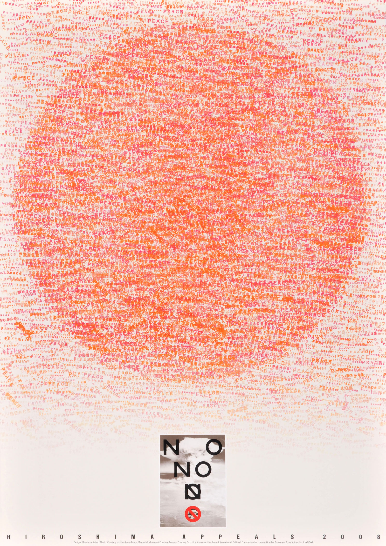
Hiroshima Appeals 2008 “Citizen’s Peace Stamp Poster” by Masuteru Aoba
I have created a poster for the Hiroshima Appeals poster campaign in conjunction with the citizens of Hiroshima. The participants were asked to press “Peace” stamps as representatives of the City of Hiroshima, Japan and the world. They were asked to press “Peace” stamps on behalf of all people who love peace. This poster was produced from the stamps for Peace of all these people. The Mayor of Hiroshima, the director of the Citizens Affairs Bureau, municipal employees, representatives of the press, the Medical Association, Hiroshima Peace Memorial Museum, local students, members of the local branch of the Japan Graphic Designers Association (JAGDA), designers of recent Hiroshima Appeals posters, the JAGDA secretariat, Toppan Printing Company technicians, friends, acquaintances, family members and by six-year-old and two-and-a-half-year-old grandchildren of mine all participated. Thank you! I ask all of you to write “Peace” at the end of the journal entries, e-mail and letters you write from day to day as a substitute for the Peace stamps. “Take care. Be seeing you. Peace!” or “Today was a great day. Peace!” Let’s say the word everyday, over and over again, like a mantra: Peace! Let each and every one of us cultivate peace in our hearts. Peace is something we keep safe in our hearts and minds. It is something that is diffused by our hearts and minds. It is not something that can be defended or spread by military might. Both peace and war thrive in hearts and minds. Each and every one of us must strive to cultivate peace in our hearts and minds.
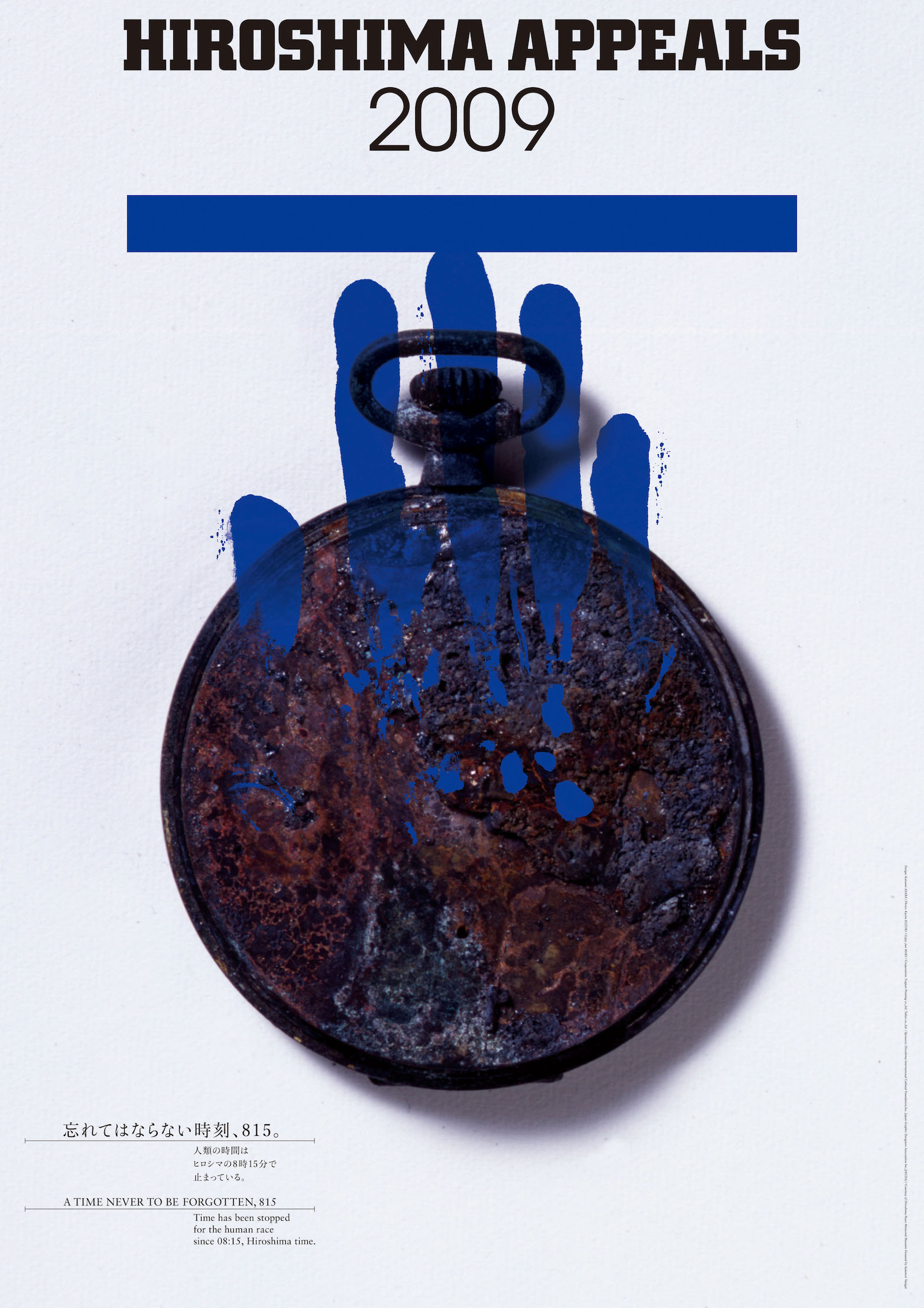
Hiroshima Appeals 2009 “A Time Never To Be Forgotten, 815” by Katsumi Asaba
The pocket watch was ticking away faithfully, keeping good time even on that day. It was a bright and sunny morning. The hands of the clock read after 8 o’clock. At 8:15 on the morning of August 6, 1945, the sky over Hiroshima burst into bright red light, the flash sending flying everything in its path. Sixty-five long years have elapsed since that day. Nuclear arms have continued to proliferate and the world has more nuclear powers than ever. In July this year, designer Issey Miyake contributed a courageous piece to the editorial pages of the New York Times. In that article, Miyake appealed to President Obama to attend the Peace Memorial Ceremony on August 6 and expressed a fervent wish that the American president would accept his invitation. Issey Miyake was seven years old when the atomic bomb was dropped on Hiroshima and as a survivor of that bombing his voice carries an unprecedented power. With the US and Russia now calling for the elimination of nuclear weapons, 2009 promises to be a momentous year in the movement for universal peace.
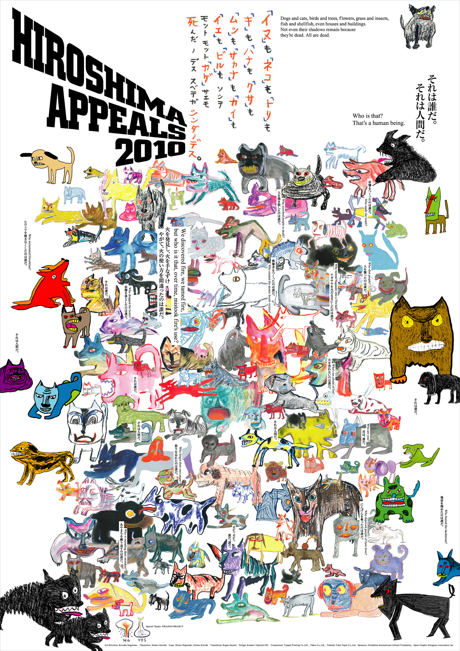
Hiroshima Appeals 2010 “MAD DOG” by Keisuke Nagatomo
It’s been 40 years since I and Seitaro Kuroda have established the design office K2, taking the initials from our names. Both of us being 71 years old this year, I am amazed to know how long we’ve been working together. I think we are the last generation of Japanese with the memory of the World War II, experiencing the war just before entering the elementary school. It is about time that we pass our war stories to the younger generations. Kuroda has established the project “A Story We Must Not Forget” 20 years ago and has continuously been sending messages of love and peace to the world through picture books, essays, TV programs and animations based on Akiyuki Nosaka’s “Collection of War Stories for Children” and through “Live Painting” performances. I consider this poster “MAD DOG” as an extension of such activities. Using a poster as a media, as I have always been, I would like to send the message of love and peace to the world.
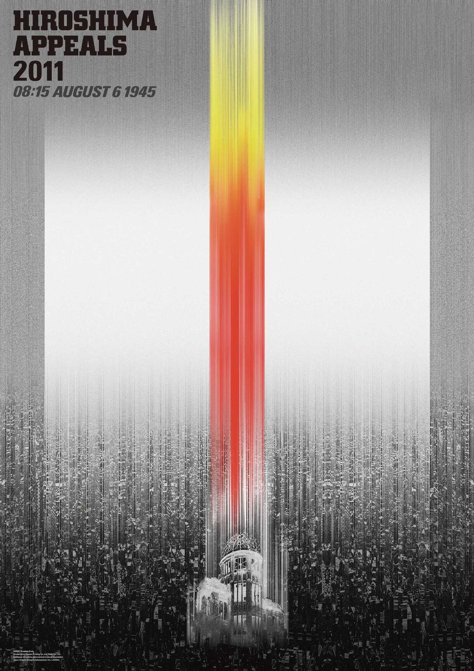
Hiroshima Appeals 2011 “A Flash of Catastrophe” by Susumu Endo
March 11, 2011: Disaster at Fukushima nuclear plant!
A few days later, I was asked to design this year’s Hiroshima Appeals poster. Soon my mind was set on going to Hiroshima. It was my third visit to Hiroshima Peace Memorial (Atomic Bomb Dome), but this time, I stood before the building with a new sense of tension. As I took photographs of the site, the image overlapped that of the blasted reactor building of Fukushima daiichi nuclear power plant. It was then and there that the basic direction of the poster design was solidified. Ongoing discussions on nuclear power and a sense of crisis in Japan, I believe, led me to that direction. Choosing the memorial as the subject of the poster is an easy answer that may result in banality. But I dared to take up the challenge. My young granddaughter saw me tackling with the piece of work and exclaimed, “That’s the Hiroshima Peace Memorial!” I continued working on it thinking, “Now, what message can I convey through my expression?”
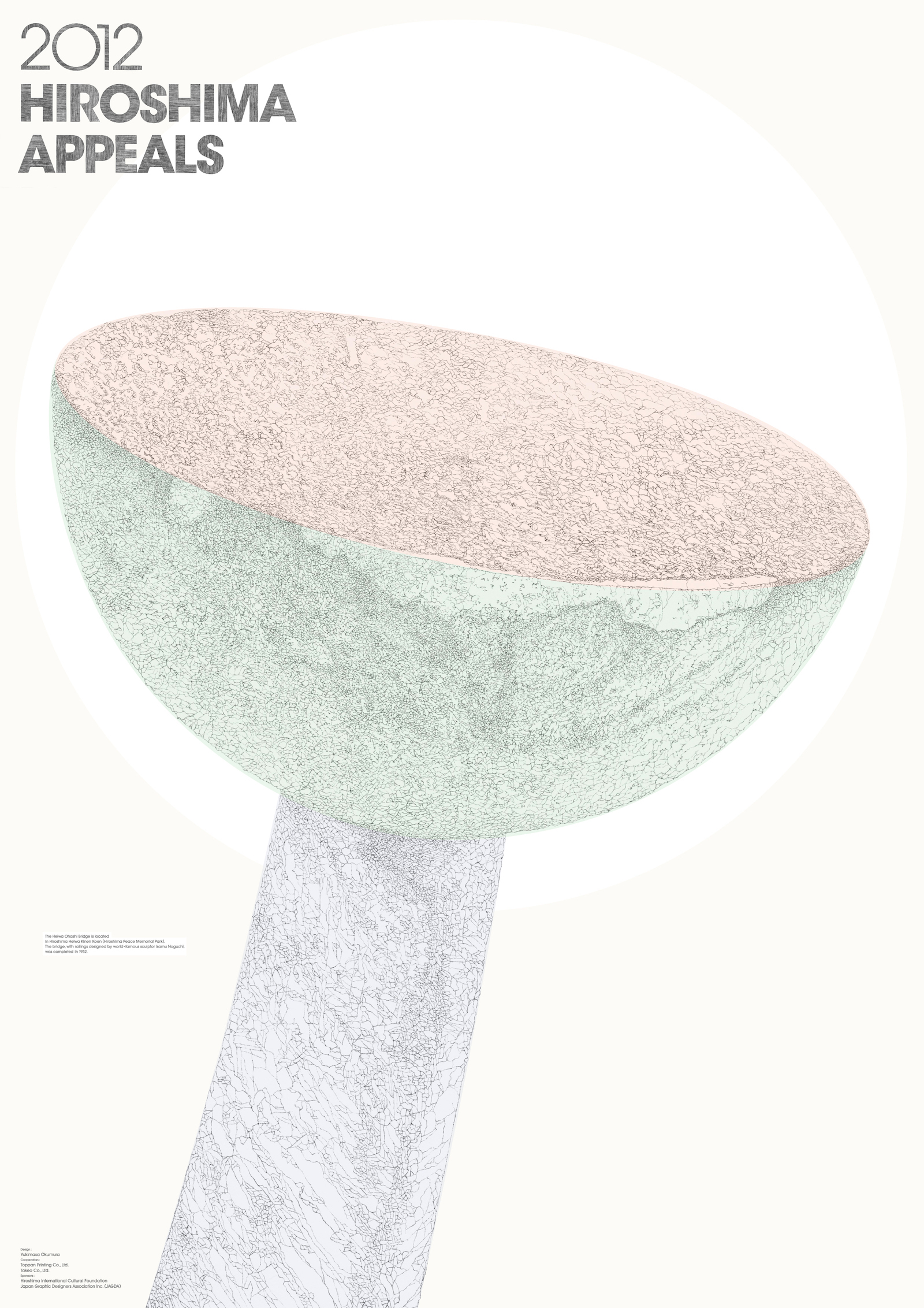
Hiroshima Appeals 2012 “HEIWA OHASHI” by Yukimasa Okumura
I was requested to create a poster for Hiroshima Appeals for the first time as a graphic designer born after World War II. At a later date, I walked around Hiroshima City and decided eventually to create a poster under the theme of the railings of the Heiwa Ohashi Bridge, designed by Isamu Noguchi. I sketched the railings and shot them with a 6×6 film camera until sunset. After returning to Tokyo, I prepared for poster creation, selecting photographs and tracing large prints with India ink and fine-point brushes. I also hand-drew the logo. I continued to work on the poster, and it took around two weeks. I selected this method because I believed that it was adding labor (my own work), instead of expressing myself, is the only way for me, who was born in 1947, to commit to the theme of Hiroshima.
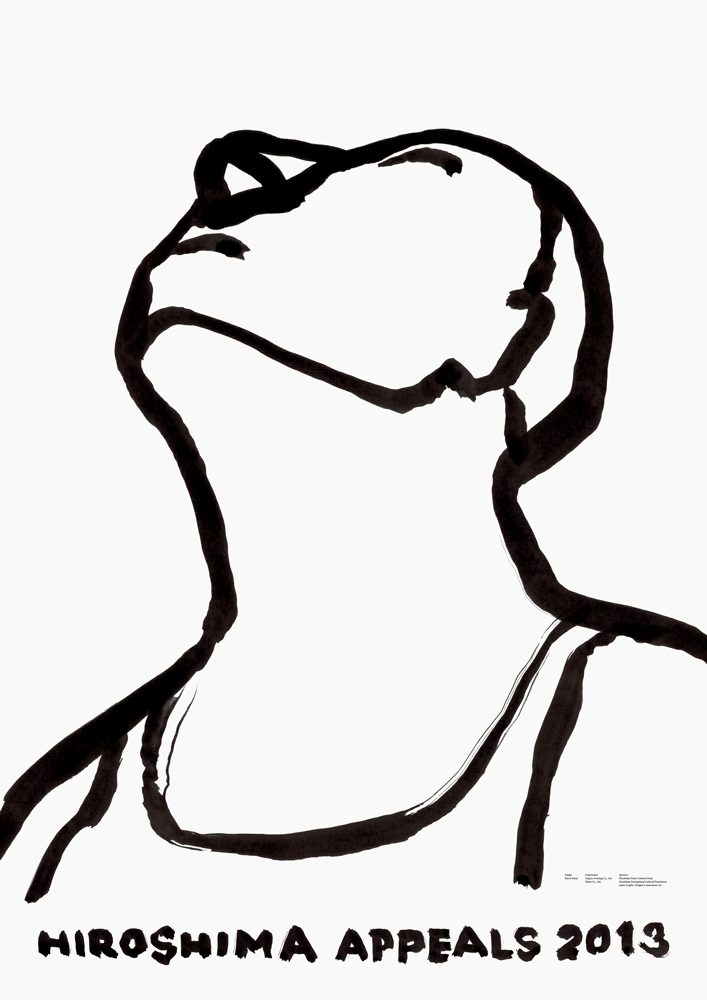
Hiroshima Appeals 2013 “Natsu no Hi no Mabushisa (Glare of the Sun in Summer) ” by Kaoru Kasai
The glare of the sun in summer is accompanied by sadness. I picked up a brush in front of a white paper and drew this picture without thinking. Various feelings came to me while I repeated drawing, and then I could not keep drawing any longer. We are supported by somebody, and we think of somebody. That’s why we can live. An atomic bombing can by no means take our heart away from the yearning or affection for the people that we love. I deeply hope that this poster can accompany what victims and survivors feel.
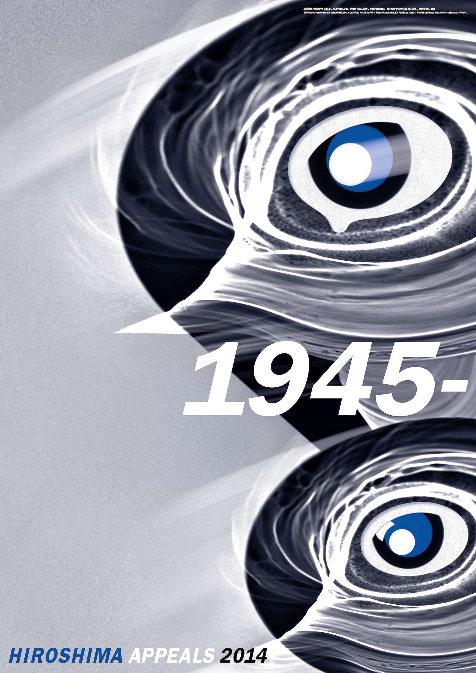
Hiroshima Appeals 2014 “Reminiscence” by Tsuguya Inoue
Many years ago, I picked up a photobook of atomic bomb disaster titled “Hiroshima,” and the photo caption for the smiling children grabbed my heart. It read, “Atom-bombed children say that from now on, they want to live merrily like little birds. But these little birds are extremely self-conscious about the a-bomb scars on their bodies.” Born after the war, we build up our knowledge of the atomic holocaust with fragments of information, as memory that fades in distance with time. But as we learn more about the radiation exposure through photos, films and books, the act of instant killing breaks our heart and reminds us of the terror of nuclear explosion. There is a danger in shutting the door on the past, even though it might let us enjoy our present life. Keeping the 1945 disaster in mind, I hope for the realization of the nuclear-free society, without relying on “nuclear umbrella” deterrence, no matter how long and tough the road is. While designing this poster, I tried to listen to the voices of those killed by man-made explosives and my inner voice saying that “all life desires to survive.” The living creatures in this poster were gradually formed, expressing time and memory, with photos of sunlight and shadow taken in a clear day by Ryota Atarashi. These two generations of creatures lament the fading of the memories of war, and with strong anti-nuclear sentiment, urge us to pass on the “memory of 1945” to the next generation.
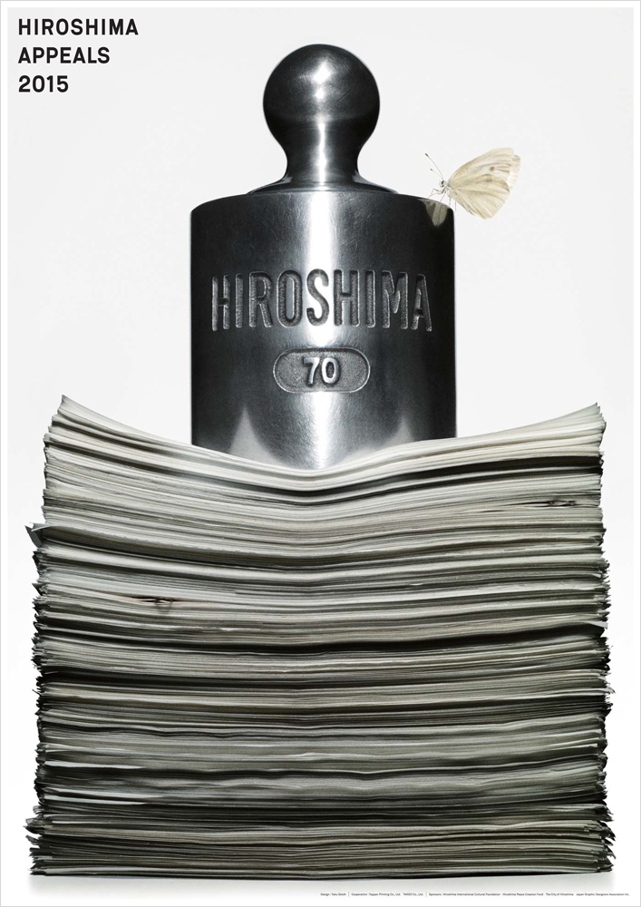
Hiroshima Appeals 2015 “The Weight of Hiroshima” by Taku Satoh
I’m the fourth designer of a “Hiroshima Appeals” poster to have been born in the postwar era, and I struggled even more than I imagined in deciding what kind of visual I should aim for. What I ultimately decided on was a large balance weight, of the kind normally placed on a balance scale, sitting atop a pile of documents. Seventy years ago Hiroshima’s fate hung in the balance – and an atom bomb was dropped on it. The party that drops a bomb has an argument to justify its actions. In my graphic, the balancing weight named Hiroshima is a heavy one, and it presses the documents down greatly. The documents represent every kind of “argument” imaginable, and the weight of Hiroshima presses down on them. My intention was to express that there are some things that, no matter what argument might be put forward, one must never do. A lone butterfly is seen perched on the weight. I intended it as a reincarnation of the burning butterflies depicted in the very first “Hiroshima Appeals” poster, by Yusaku Kamekura.
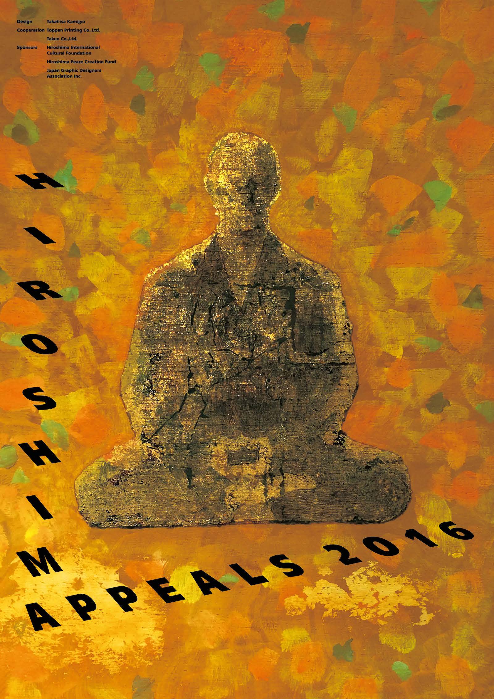
Hiroshima Appeals 2016 “Landscape of Prayer” by Takahisa Kamijyo
The first visit to Hiroshima by a sitting United States President was realized by President Barack Obama in May 2016. In his speech President Obama spoke unequivocally of his desire to “eliminate nuclear weapons.” That event could be described as a remarkable achievement that was a first in the 71 years since the end of World War II.
At that time, I had begun working on the Hiroshima Appeals peace poster and had been striving to express the tragedy of atomic bombs symbolically. However, the mindset I had had up to then underwent a major change when I witnessed the efforts of the people of Hiroshima that formed the backdrop to President Obama’s visit, and their hopes for peace. Rather than adopting a confrontational axis of stating a complaint and evoking an apology, this work is an expression centered on a desire for a deep, still and powerful peace, in the form of forgiveness, reconciliation and joint prayer.
My constant wish is that works of graphic design will become part of the landscape in cities and lifestyles. I think it would be ideal, in other words, if my inner feelings were accepted and existed as a landscape.
For the Hiroshima Appeals 2016, I gave form to my powerful aspirations and wishes for peace. My prayers have been given form. If empathy is generated as a result of that I am sure it will become a powerful message. My hope is that it will create a landscape of prayer.
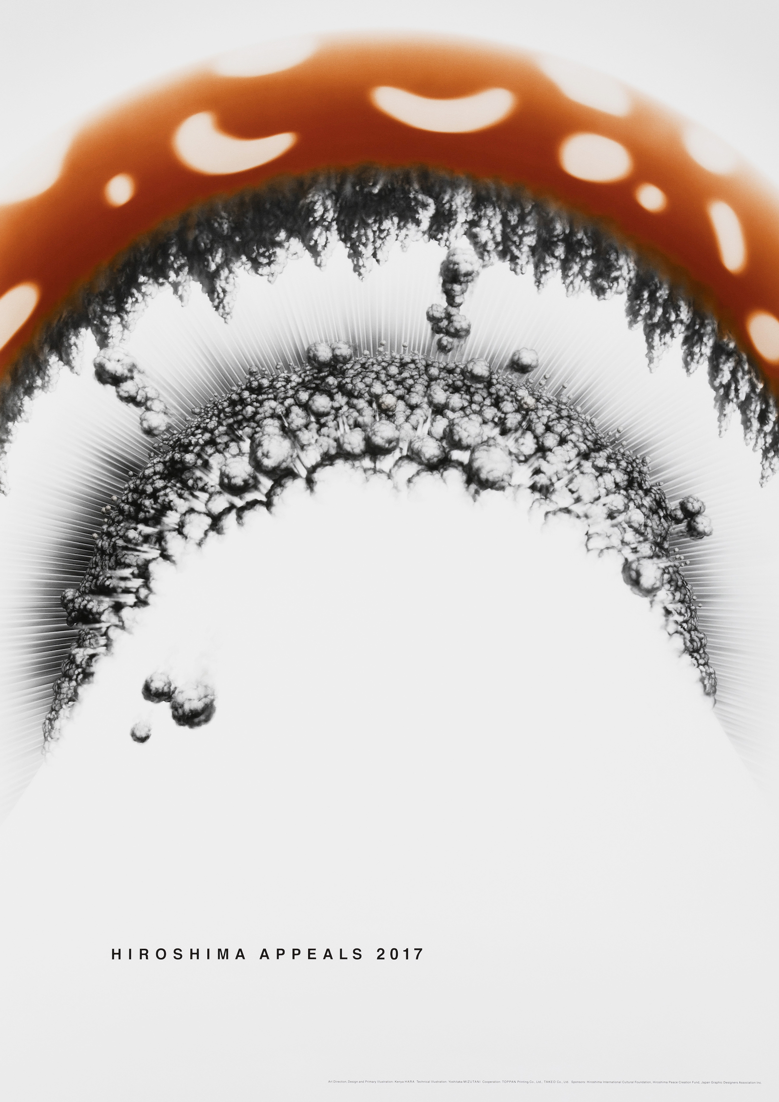
Hiroshima Appeals 2017 “Mushroom Illustration” by Kenya Hara
This is an illustration drawn from the perspective of looking up from below a mushroom cloud. The embodiment of the worst evil in human history explodes just overhead of the people of Hiroshima and of Japan. I wanted to look straight into that moment. Posters have the ability to freeze fading reality and emotion for eternity. Hiroshima Appeals expressed as posters are meaningful because they are still images. They are like creating prayers. When I thought about the people who died in the atomic bombing, various depictions didn’t work, but when I focused on the awareness that there are towns where nuclear weapons exploded overhead, I felt that could lead to prayer.
I am filled with despair with the reality that nuclear weapons are being stockpiled in quantities that can destroy the Earth several times over while being called “deterrence.” The human race is not as wise as we think. It is depressingly stupid that mankind can destroy the foundations of civilization to prioritize “self,” “country,” and “creed.” Our existence may be far more short-lived than other creatures that live in respect of nature’s bonds.
I have been doing realistic illustrations in collaboration with Yoshitaka Mizutani, whom I have known for 30 years. I create the original drawing and then he finishes it with his own detailed technique. It is a collaboration where he creates a detailed visualization of the images that are in my head. The original drawing depicted the entire mushroom cap, but we cropped it for the final version. I went one step further and stepped into the explosion.
Hiroshima Appeals 2018 “Question Mark, 2018” by Kazunari Hattori
Hiroshima appeals. What appeals could I raise with the poster I have been working to create? This seemed both obvious and self-evident, while also seeming like an unsolvable problem. As I came into contact with the materials left behind I was bowled over by Hiroshima and the atomic bomb, which is something I should have already known about. I have neither the qualifications nor the capability to speak for Hiroshima. I began by first becoming self-aware of this fact.
Seventy-three years have passed since the day when an atomic mushroom cloud rose up into the sky over Hiroshima. What I depicted with my poster was how things stand in the world of 2018, where various problems still remain unsolved and numerous questions are left suspended in midair.
Perhaps it is out of fear that I will be laughed at as people wonder what appeal I was trying to raise with this poster of a happy-go-lucky question mark-shaped cloud that I am writing this composition that reads like an excuse. Yet separate from the end result of the poster, in some way I feel as if there has been some small significance in this personal experience of thinking about Hiroshima. I want to believe that, by each of us continuing to ponder the questions raised by Hiroshima, we will be able to find something that we are currently still unable to see.

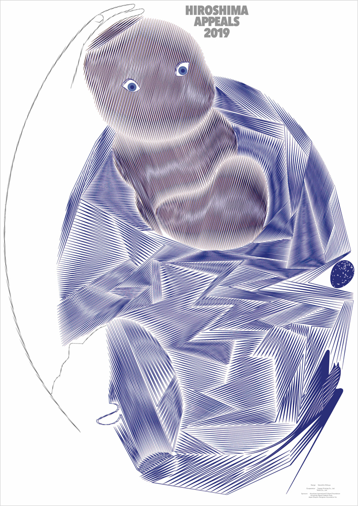
Hiroshima Appeals 2019 “Hope” by Katsuhiko Shibuya
In a book about the immediate aftermath of the bombing of Hiroshima, it was written that “swallows whose feathers were scorched and were unable to fly were walking along the ground by hopping about.” Naturally, there was no trace left of the birds that had been flying through the center of the explosion, but the very fact that swallows, the most agile of all birds, had their feathers scorched illustrates the instantaneous power of the atomic bomb like nothing else. Did chicks wait endlessly in their nests for their parents, which were no longer able to fly?
A long time has passed since the atomic bomb fell on Hiroshima, and many of the city’s citizens are the children and grandchildren of the victims of the bombing. Nevertheless, the things that were destroyed at that time are carried within them and do not end. Therein lies the extraordinary nature of this atomic bomb, I feel.
Children are the hope of the future. In order for the world that new generations live in to continue to be peaceful, I want as many people as possible to convey the story of Hiroshima to the adults of the world. It is this wish that I embodied in the poster.
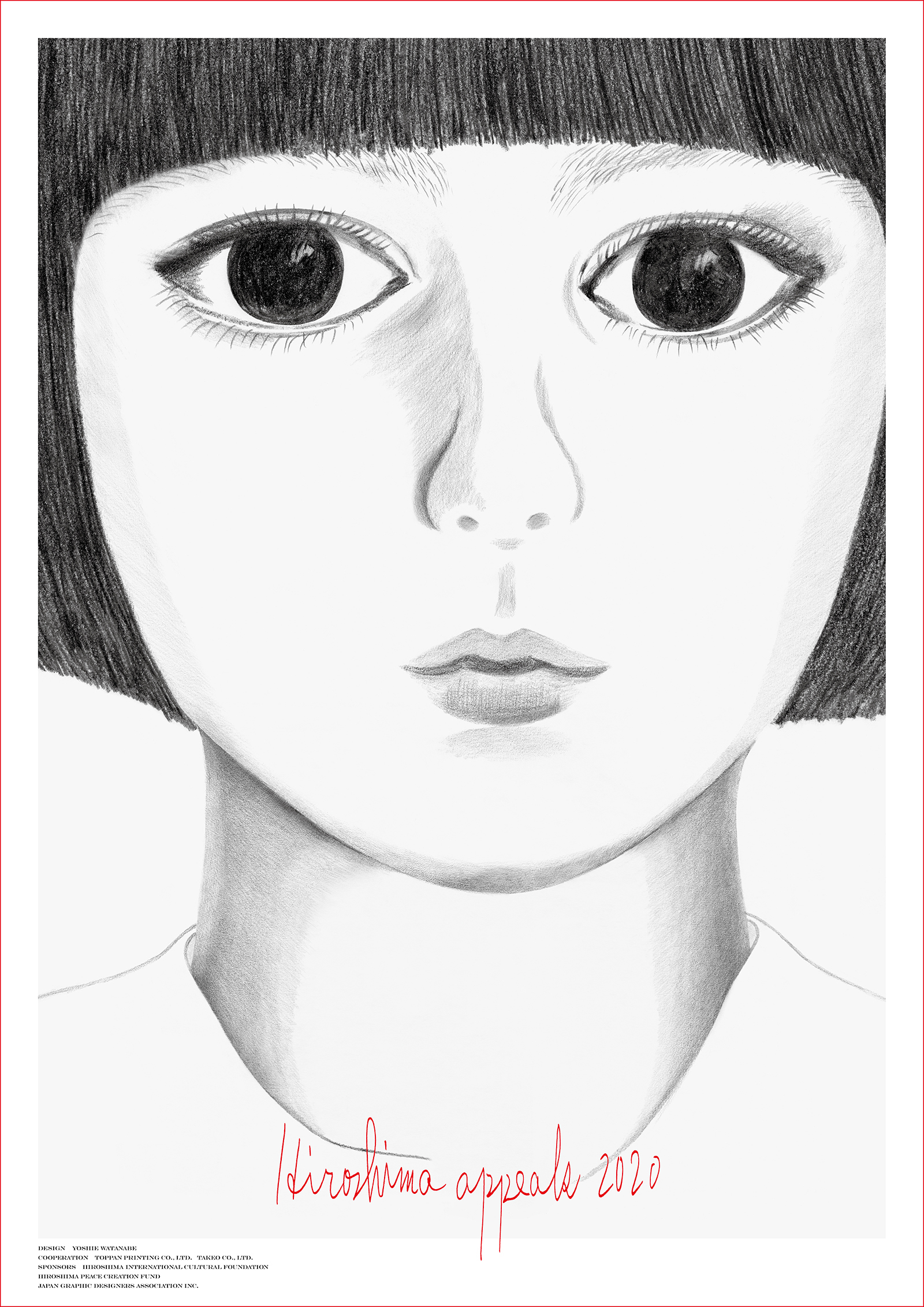
Hiroshima Appeals 2020 “Life” by Yoshie Watanabe
Being able to enjoy peace in our everyday lives is something special. As I write these words, the world is fighting against a virus, a crisis that has also prompted countries to engage in information and economic wars.
To me, it appears as if the world is becoming increasingly complicated and more and more greed is rising to the surface. This fills me with great sadness. No matter how much I wish it were so, I do not think the world will be at peace anytime soon.
If that is the case, as a starting point, Japan must do all that it can, and we must each do all that we can, to protect this country and our lives. That is all we can do.
When I was asked to create this poster, my aim was to portray “life.” This little girl represents my mother when she was a little girl, me when I was a little girl, all the little girls in Japan, and all the little girls around the world. I hope that this “life” will shine bright.
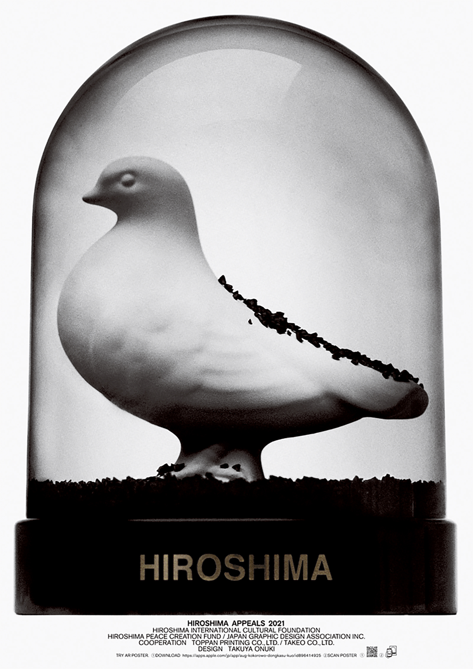
Hiroshima Appeals 2021 “HIROSHIMA” by Takuya Onuki
For many years, I have made a living by conveying ideas to many people or “advertising.” I believe advertising is presenting a future that is brighter and more fun than today, even if only by a little. However, this time, I felt that the way to help create a more hopeful future is to convey to young people that the threat of nuclear weapons is not part of history, but a very real part of their lives, and, by doing so, ensure that the reality of nuclear weapons doesn’t fade from our minds, but stays etched in our hearts. As someone who works in visual expression, it is very sobering to be involved in the activities of the Hiroshima Appeals, which seeks to clearly inform the next generation of the existence of nuclear weapons amid the continued decline in the number of “kataribe” or people who experienced the atomic bombing.
This year’s poster uses augmented reality (AR). Inside the snow globe there is a white dove, the symbol of peace. Normally there would be white powder in the snow globe, but for this piece, we have black powder. If you place your phone over the photo, it starts to move,* as if time is working in reverse. Eventually, the dome is filled with the black powder, which may bring to mind the idea of peace being crushed by war, nuclear weapons, and “black rain,” etc., and create a real and gut-wrenching sense of war. Ultimately, the black powder falls slowly to the ground, at which point a completely motionless white dove appears.
Conventionally, I believe a snow globe is also a device for making each person viewing it imagine their own story as they watch the snow falling slowly down. My aim, in expressing this work in this way, is to encourage the younger generation, who no longer view nuclear weapons with a sense of reality, to take the time or even just a moment to think and imagine. If I could elaborate further, there is something I want people to notice as they look through the glass and take a bird’s-eye view of war and the atomic bombing – the white dove, trapped in the glass dome, has yet to fly free. I pray for the day when the white dove will be able to fly free in our world.
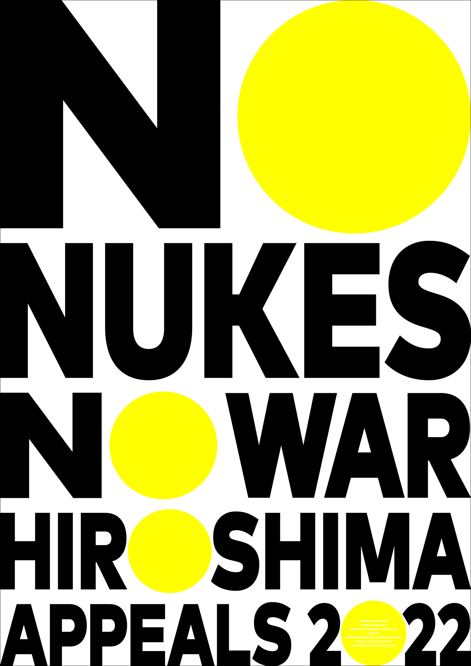
Hiroshima Appeals 2022 “NO NUKES NO WAR” by Kashiwa Sato
February 24, 2022: Russia invades Ukraine, followed by threats to use nuclear weapons. With tensions rising around the world, the Stockholm International Peace Research Institute (SIPRI) in Sweden, announced that the risk of nuclear weapons being used seems higher now than at any time since the height of the Cold War, and although marginal decreases in the overall number of nuclear warheads have been realized until now, nuclear arsenals are expected to grow over the coming decade. We are currently facing the harsh reality of increasing tensions in the global security environment. As the only country to have suffered atomic bombings Japan has a special role to play in sending out a message to the world about the horrors of nuclear weapons. I have a strong sense that now is the time to send out a clear and stark message towards a world free of nuclear weapons. The poster boldly features just typography, with the message “NO NUKES NO WAR HIROSHIMA APPEALS 2022” forming the main visuals in a design featuring dynamic letters and numerals. The letter “O” and the number “0” on this poster have been stylized as yellow circles. The circular shape is described as “wa” in Japanese, which is also the same pronunciation as the Japanese word meaning peace, or harmony. As both of these words are pronounced the same way, the “wa” in this design holds a dual significance in its message to the world. It symbolizes a ray of hope for the future that we can attain peace and overcome these dark and difficult times. It is my dearest wish that each and every one of us will light up the hope in our hearts and come together so that we can spread as many rays of hope as possible, and that the activities of Hiroshima Appeals will make a contribution, however small, to world peace.